


I'd love to hear from you — whether you have a project in mind, or just want to say hey.
hey@adamfultondesign.com

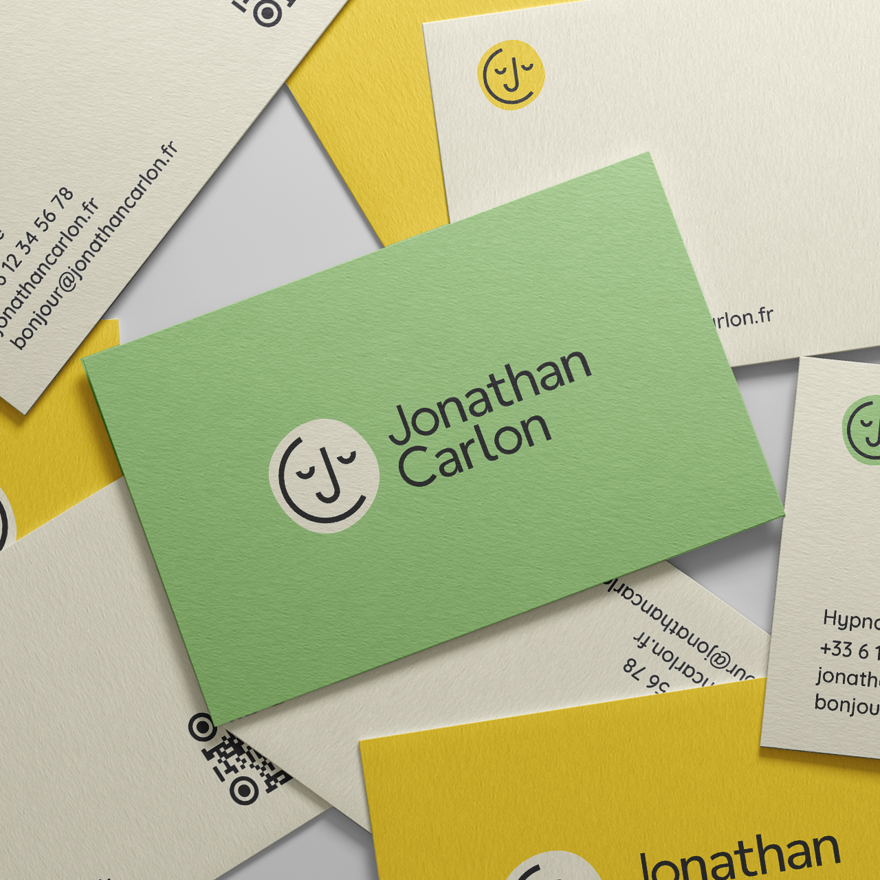
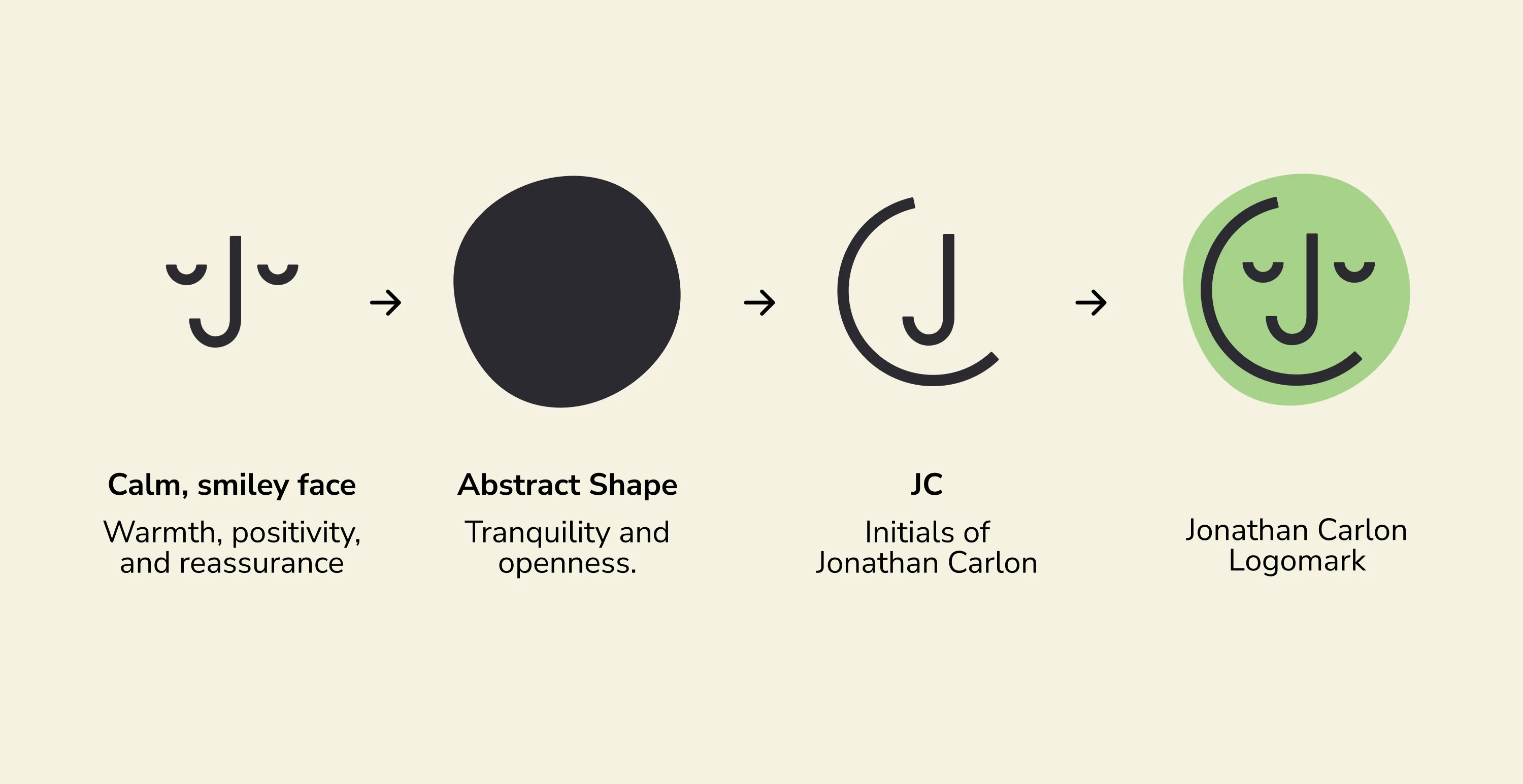
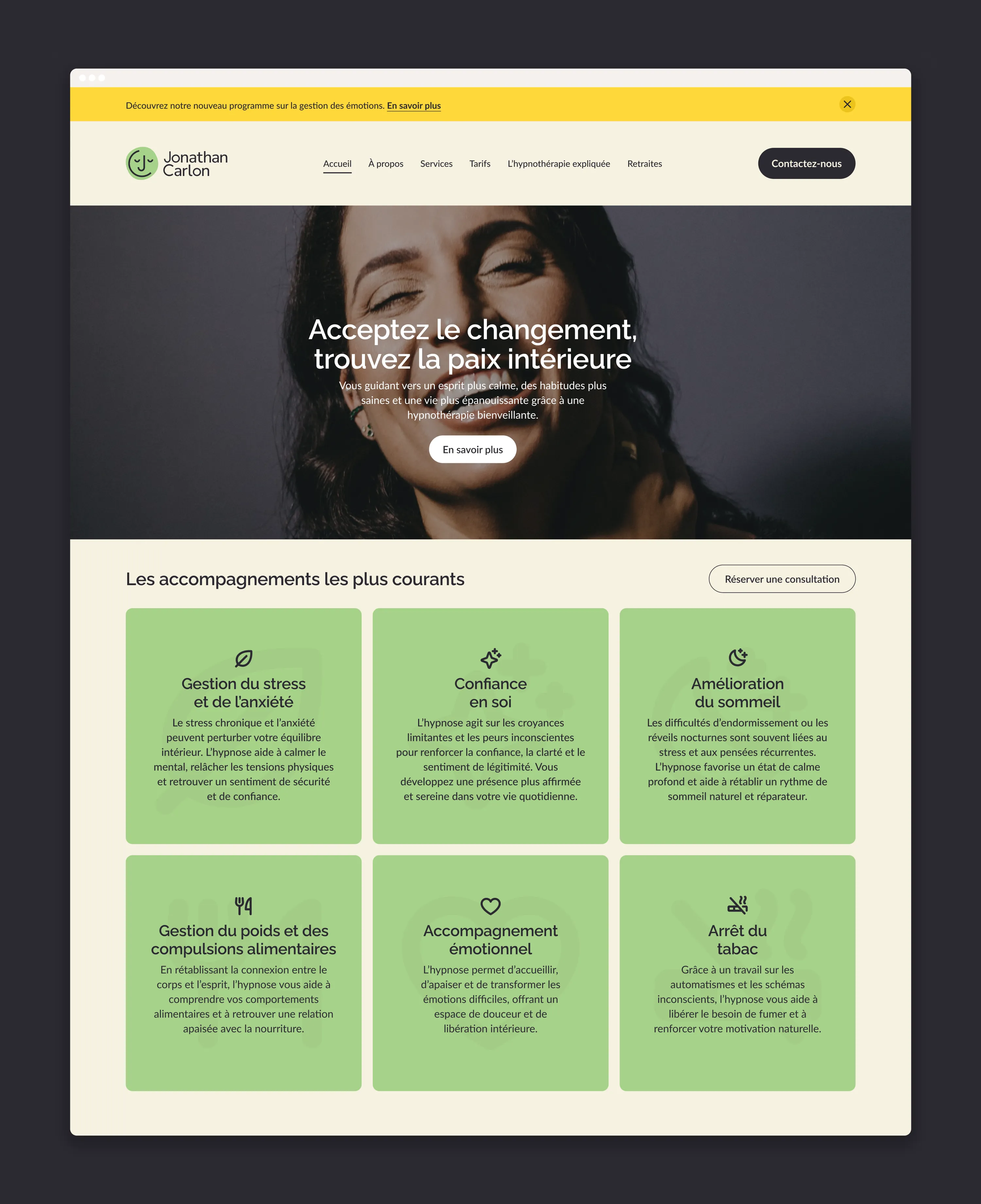
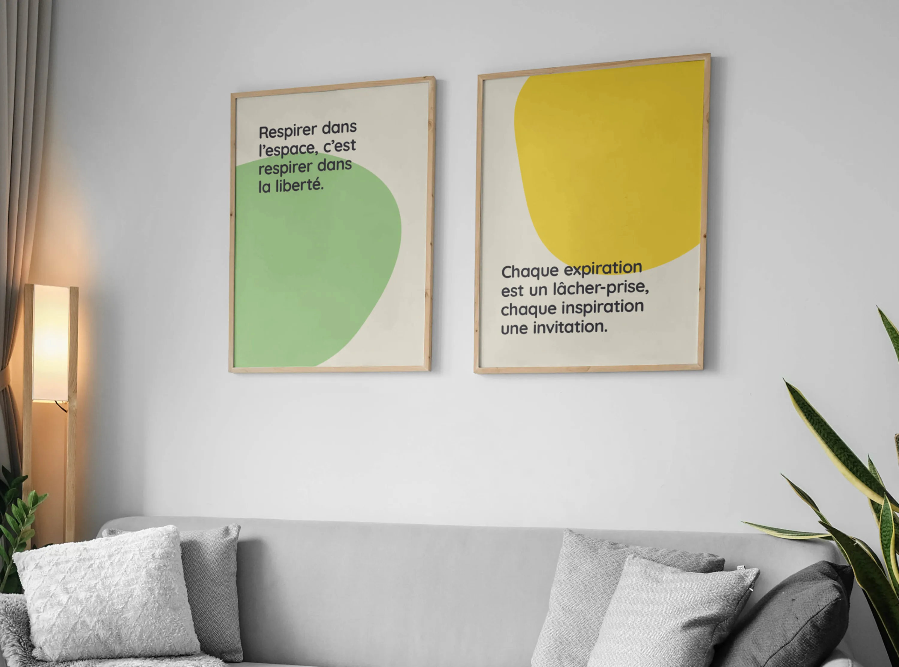
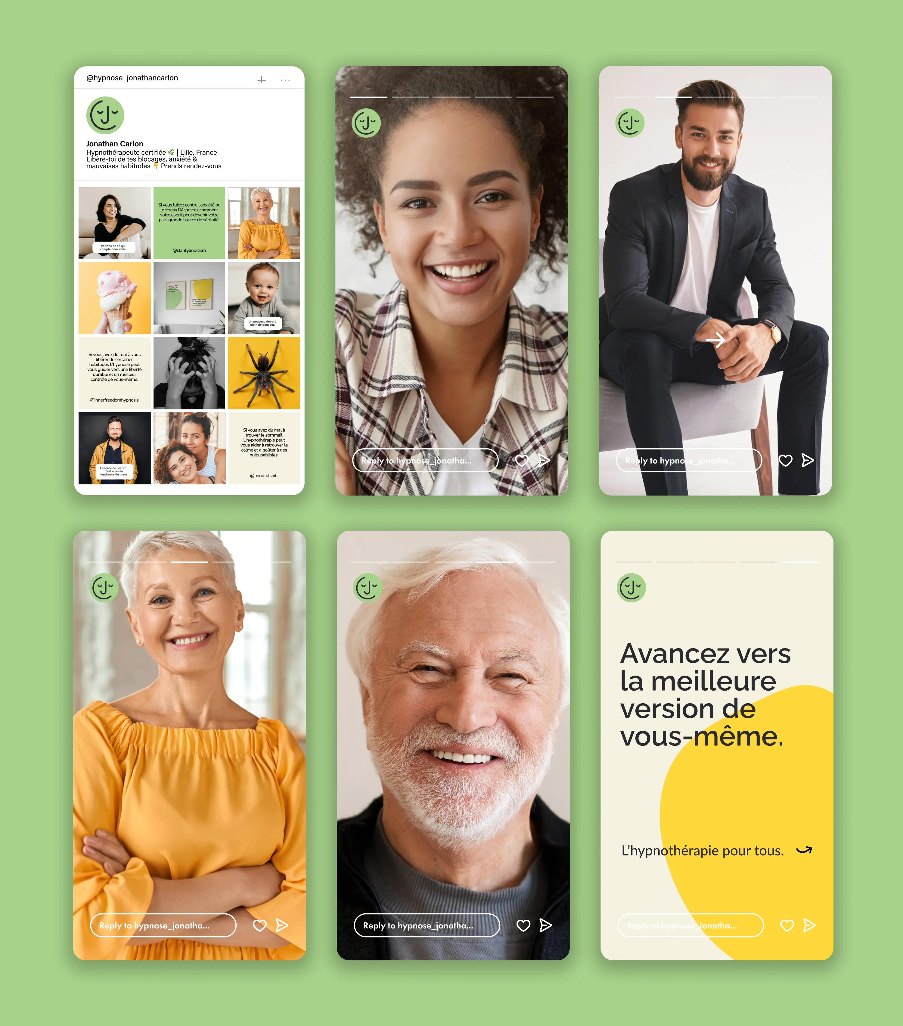
I designed a simple, friendly logomark featuring a calm, smiling face that subtly hides Jonathan’s initials, J and C. Behind it, a soft, abstract shape adds a sense of openness and tranquility, reinforcing the welcoming tone of the brand. The colour palette combines a gentle sand beige, a fresh leafy green, and a bright sunshine yellow to create a look that feels positive, grounded, and full of light.The result is a fresh, approachable identity that reflects Jonathan’s warm, confident approach and helps clients feel comfortable and at ease from the very first interaction.