Jonathan Carlon Hypnotherapy is a French hypnotherapist based in Lille, France, who helps people find calm, confidence, and clarity through modern, evidence-based hypnotherapy. Jonathan is launching his clinical practice early next year and wanted a brand that truly reflects his warm, reassuring approach.
THE CHALLENGE
Jonathan wanted a brand that felt calm, positive, and reassuring. Many clients come to hypnotherapy feeling anxious or unsure, and it was important to move away from old clichés and create something that felt open, uplifting, and trustworthy.
THE SOLUTION
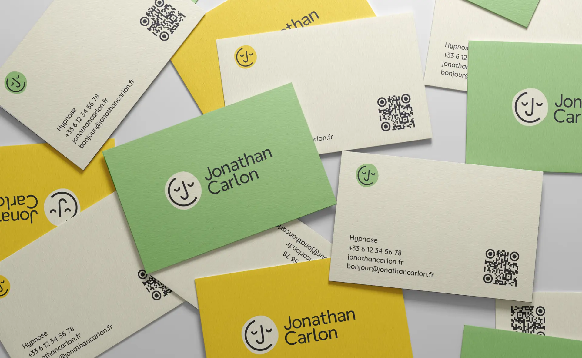
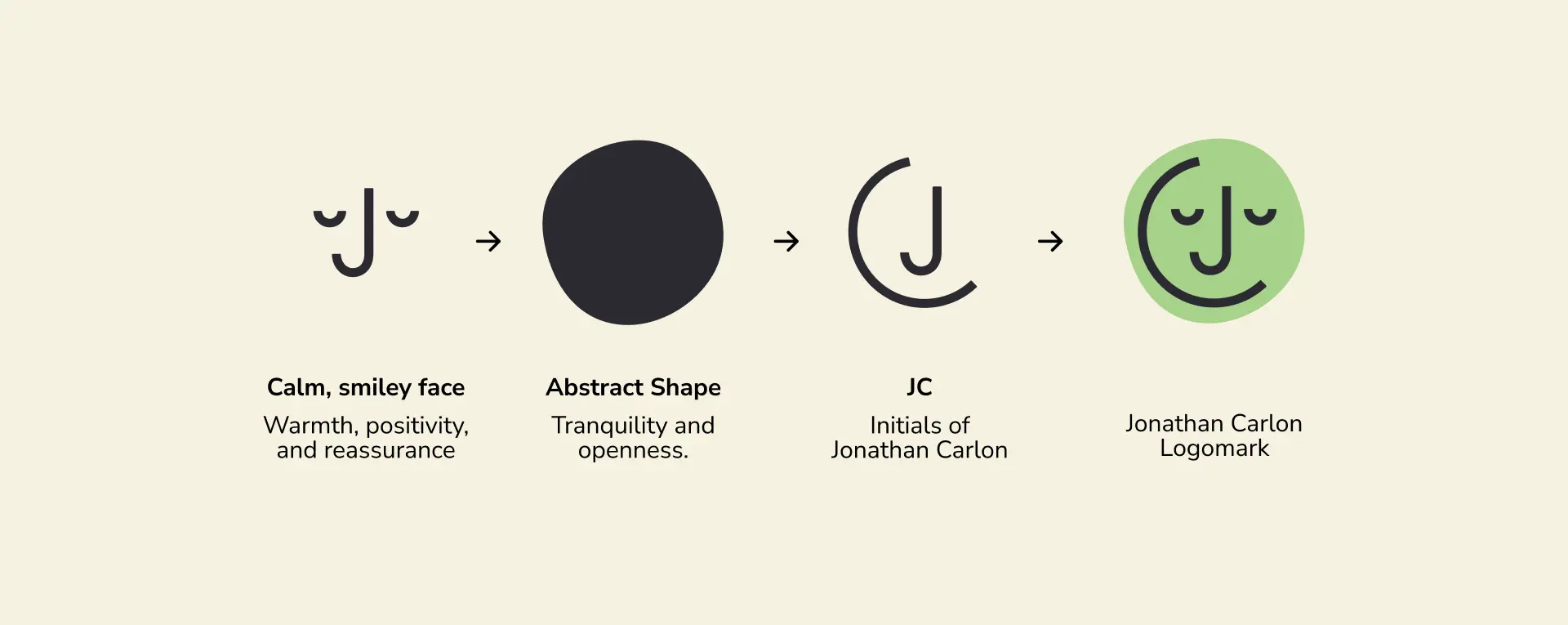
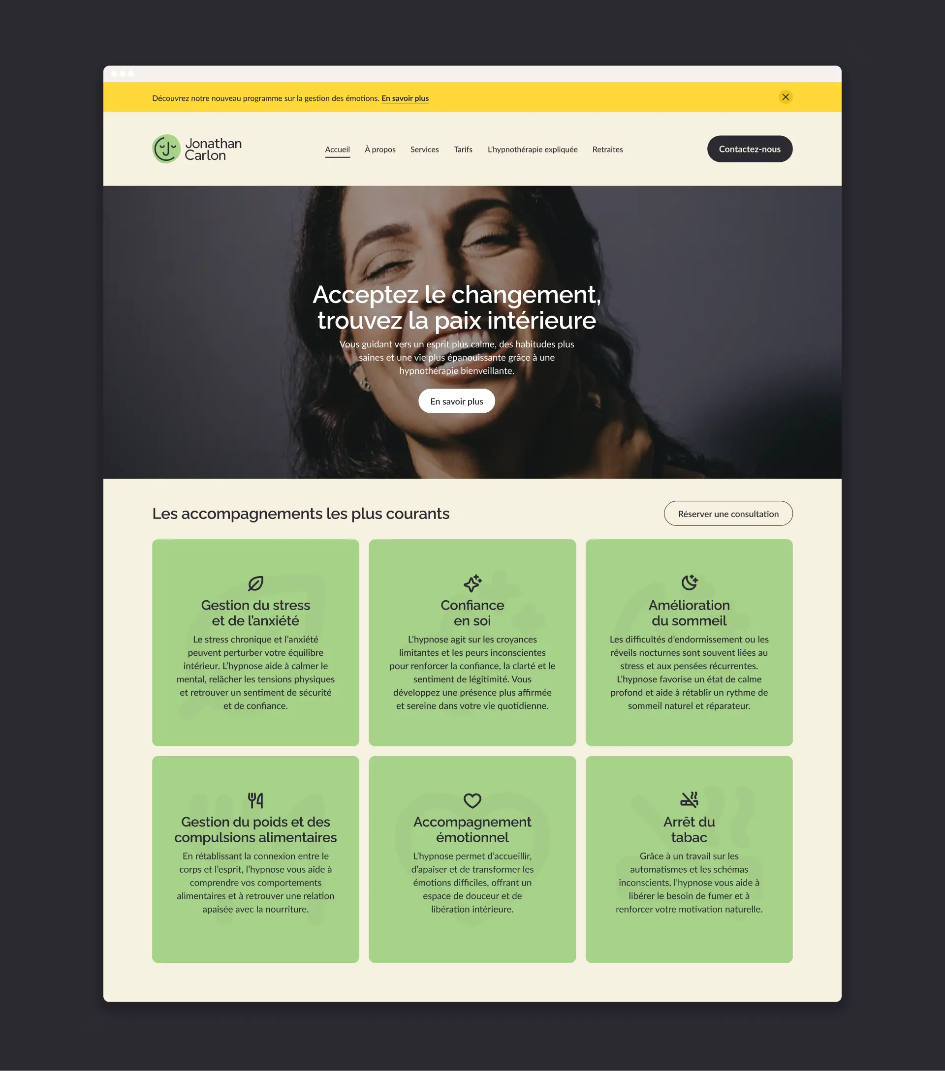
I designed a simple, friendly logomark featuring a calm, smiling face that subtly hides Jonathan’s initials, J and C. Behind it, a soft, abstract shape adds a sense of openness and tranquility, reinforcing the welcoming tone of the brand. The colour palette combines a gentle sand beige, a fresh leafy green, and a bright sunshine yellow to create a look that feels positive, grounded, and full of light.The result is a fresh, approachable identity that reflects Jonathan’s warm, confident approach and helps clients feel comfortable and at ease from the very first interaction.


